


INDUSTRY
Holistic Healthcare / Wellness
ROLE
Website UX/UI redesign
SEO optimization
Email marketing strategy & design
Conversion improvements
Automations
PRIMARY GOALS
Increase new patient bookings
Improve website usability and clarity
Strengthen online visibility through SEO
Create a more cohesive digital brand experience
Improve patient engagement through email communication
How redesigning the digital presence of a holistic wellness practice supported a 71% increase in new bookings and improved patient experience.
CHALLENGE
Hawthorn Holistic Health, a naturopathic wellness office, had built a strong local reputation through personalized care and a community-centered approach to wellness. However, their digital presence did not reflect the quality, intentionality, or professionalism of the practice.
The existing website had grown fragmented over time, resulting in an inconsistent user experience and visual presentation. Navigation felt confusing and visual elements lacked cohesion. In several areas, typography, image quality, and page layouts varied significantly, making the site feel disorganized and difficult for visitors to navigate.
Email communication faced similar challenges. Existing newsletters and updates contained dense content, inconsistent formatting, and unclear calls-to-action, making them difficult for patients to quickly engage with. As a result, the practice had limited digital visibility and missed opportunities to convert website visitors into new patients.
STRATEGY
The goal was to create a more intentional and user-centered digital experience that reflected the values of the practice while supporting measurable business growth.
The strategy focused on three primary areas: website redesign, foundational SEO, and an email marketing system.
01. WEBSITE REDESIGN
The website was completely reorganized and designed to create a cleaner, more intuitive experience for visitors.
Key improvements included: simplified navigation to help users easily locate information, enhanced mobile responsiveness, consistent typography and visual hierarchy, higher-quality visuals, refined spacing for readability, clear calls-to-action, and better organized content and service information to improve user experience and overall professionalism.
These changes helped the website feel more aligned, trustworthy, and easier to navigate.
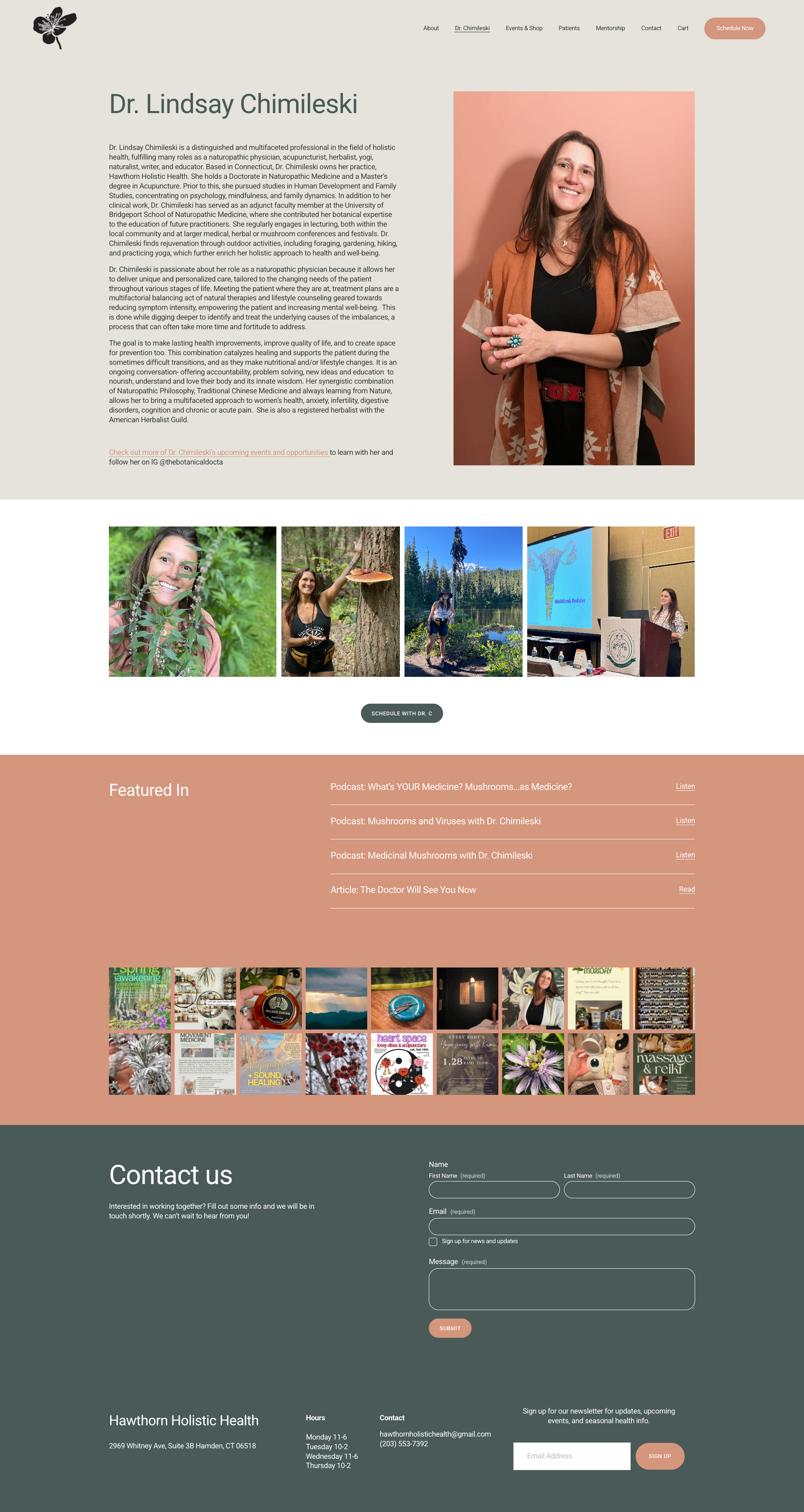
WEBSITE BEFORE
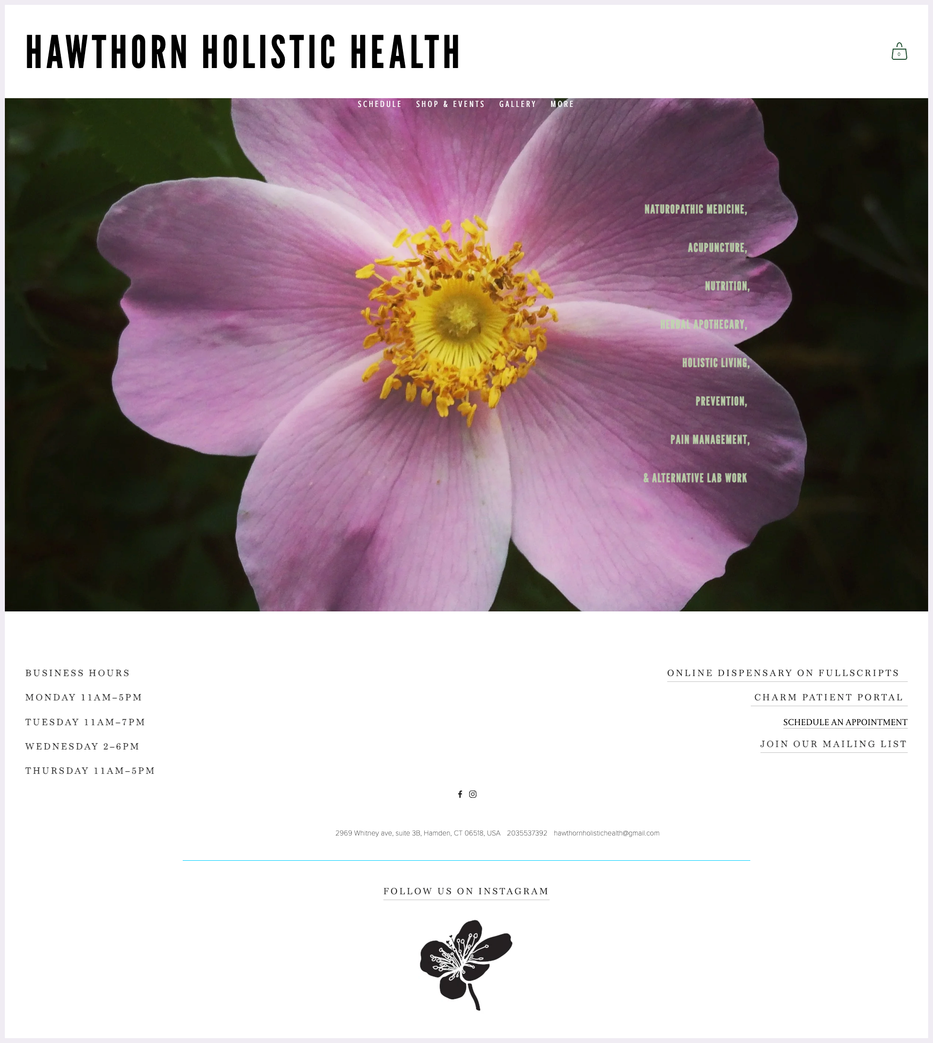
Homepage lacks substance. The oversized footer dominates the layout, with inconsistent typography and minor grammar/capitalization errors reducing overall polish.
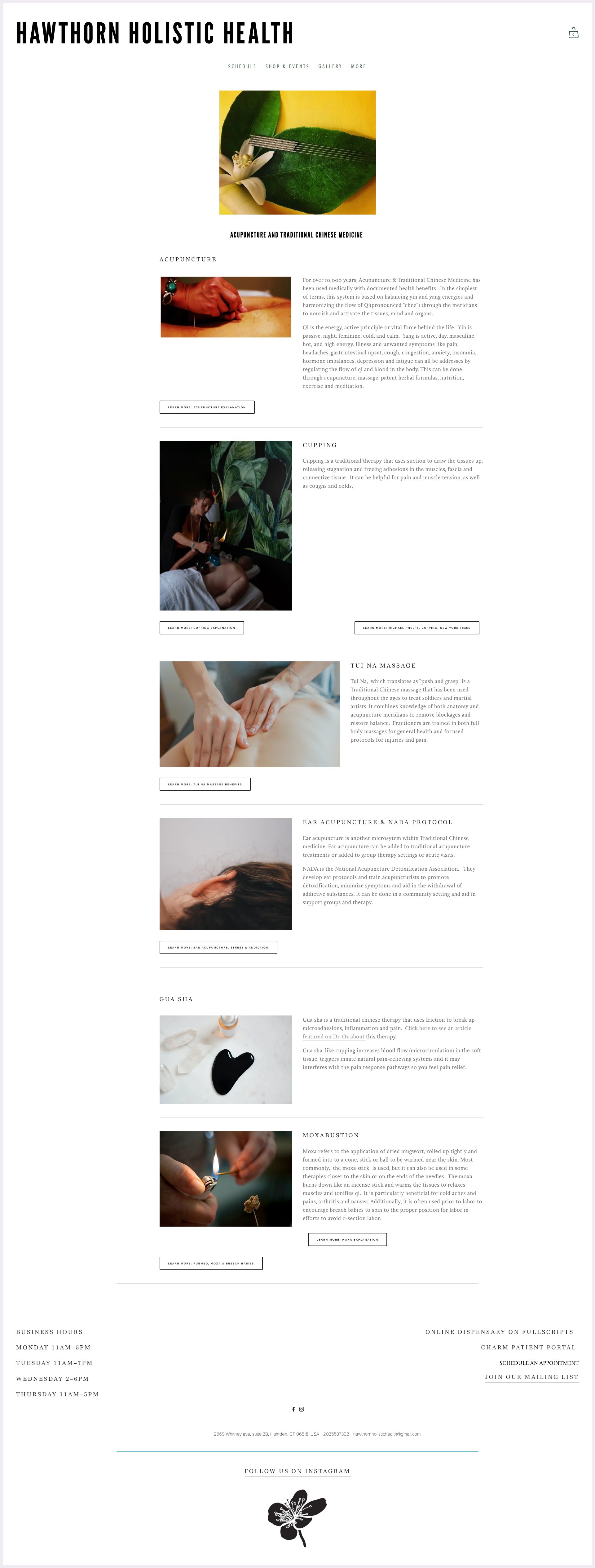
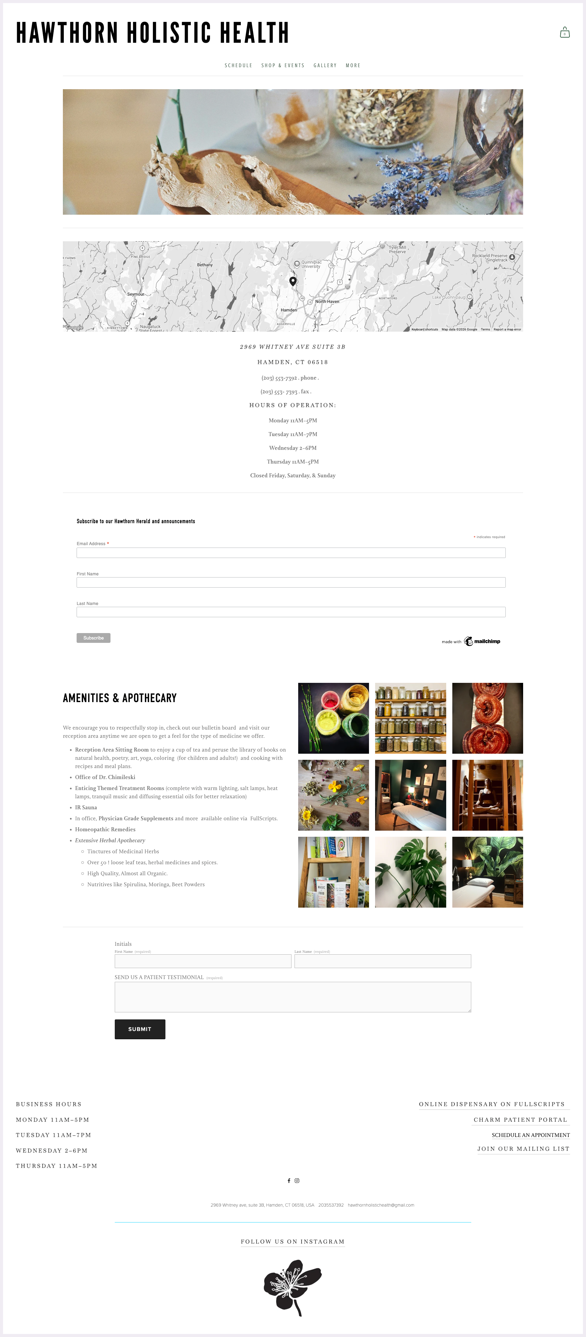
Overloaded with information, with disorganized images and inconsistently placed buttons, resulting in a cluttered, non-cohesive layout.
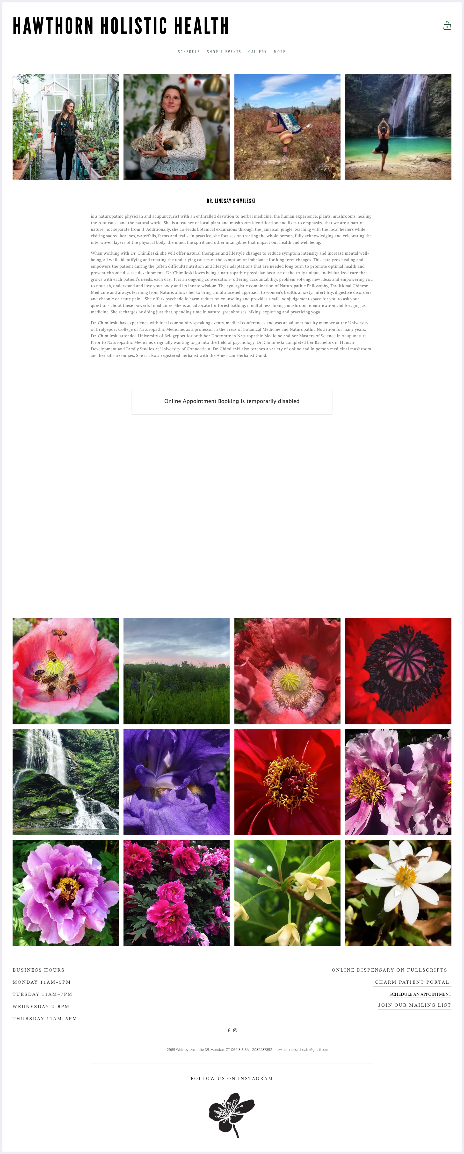
Some low resolution, blurry images and excessive white space creates imbalance, while a nonfunctional schedule section disrupts usability.
Grammatical errors and off-center content. Excessive white space further weakens the page’s structure and visual balance.
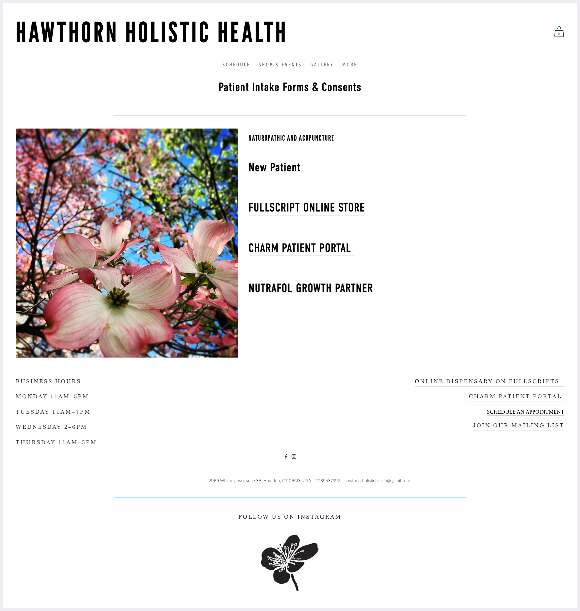
Inconsistent spacing and poor placement create an uneven, unintentional layout, with mismatched font sizes and random use of all caps vs lowercase further reducing visual consistency.
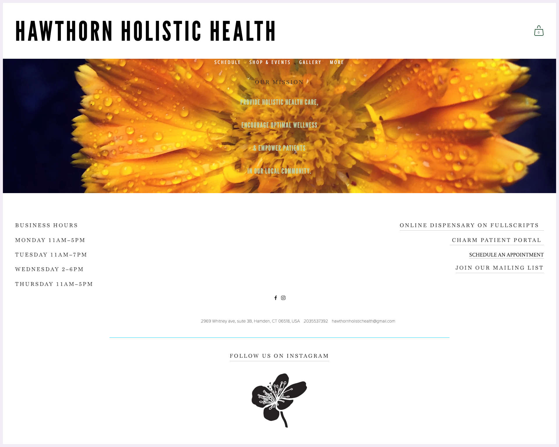
Hard to read layout with green text over a busy background image, combined with inconsistent text colors. The low-resolution image and repeated mission statement across pages further reduce clarity and originality.
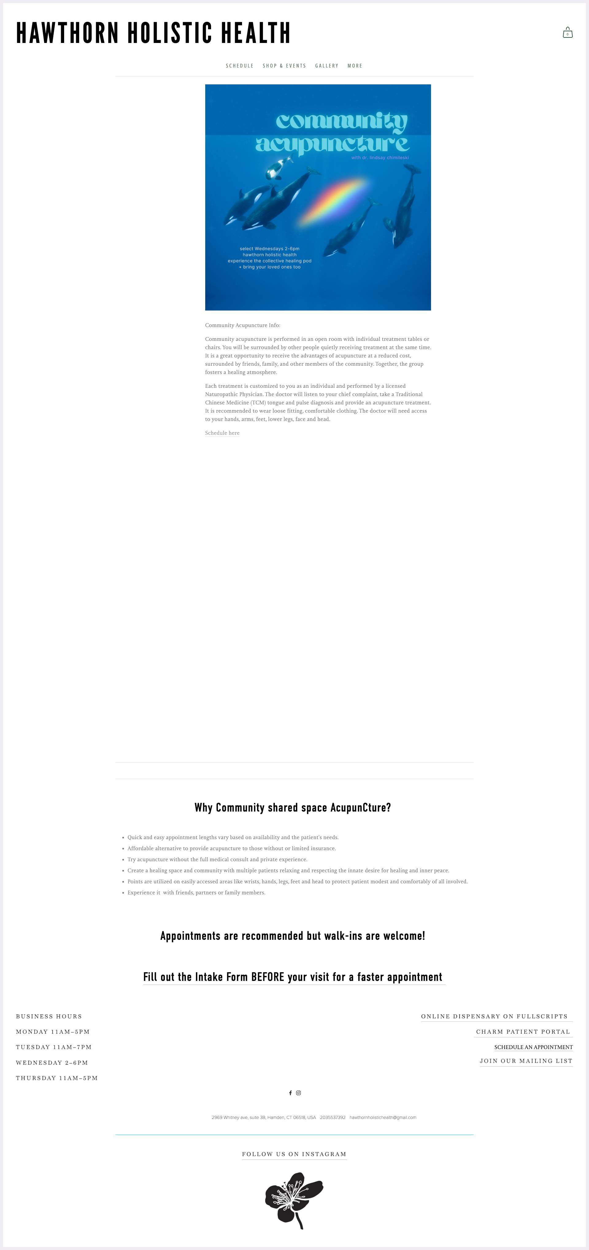
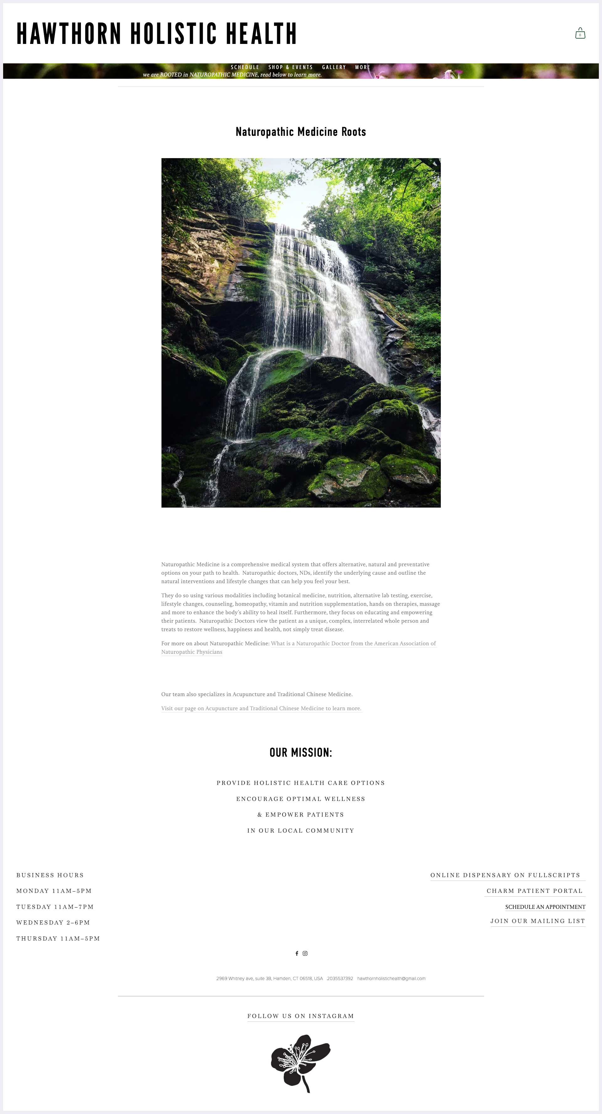
Random punctuation errors and contact details are poorly prioritized. Additionally, some content feels misplaced and would be better suited for another page, like About.
Tiny, image-based navigation is inconsistent with the rest of the site and too thin to be legible. Poor wording placement and a repeated mission statement further weaken clarity and cohesion.
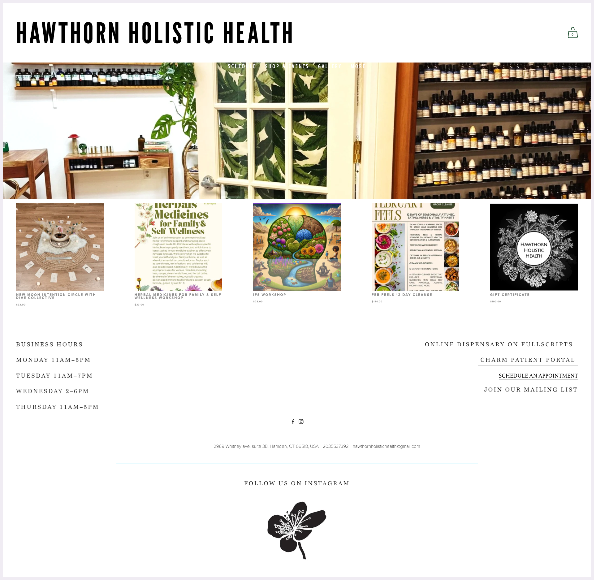
Navigation is unreadable as it blends into the background image, making it difficult to see and use.
WEBSITE AFTER
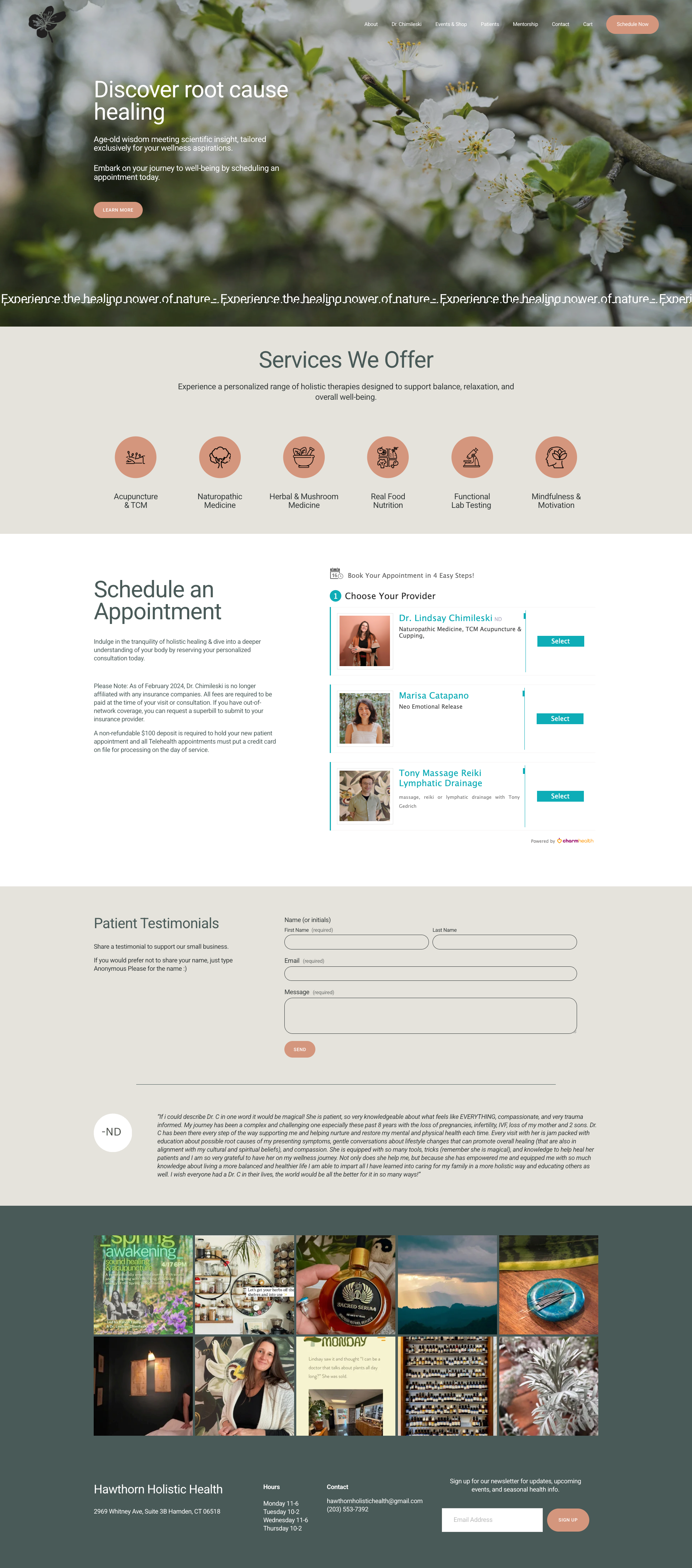
Enhanced homepage with more meaningful content, including clear service information and an easy to use embedded scheduling feature. The overall design is modern, cohesive, and significantly improves look and functionality.
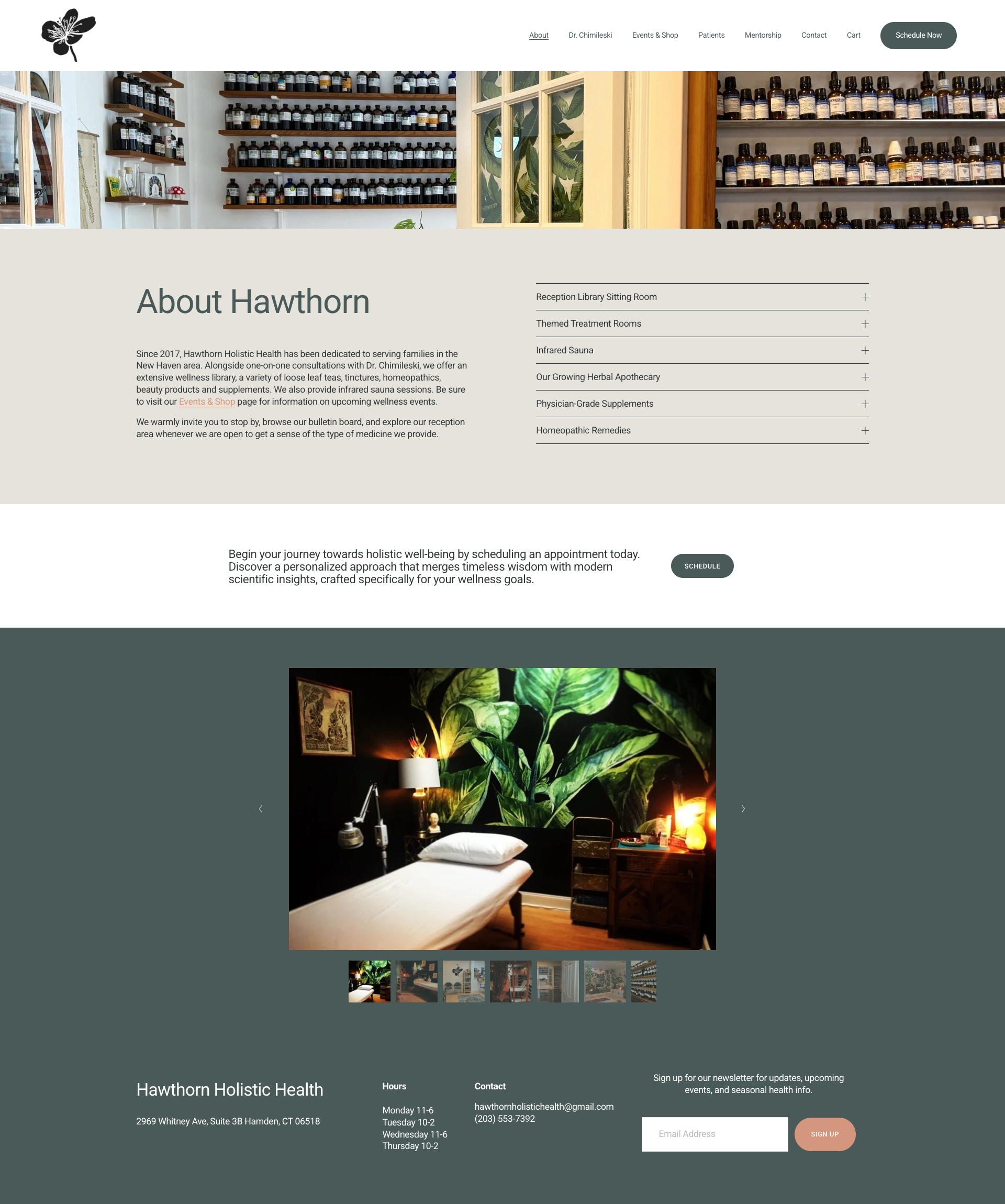
The old site didn't even have a dedicated about page. I consolidated information that was previously scattered across the old site into a single, organized section.
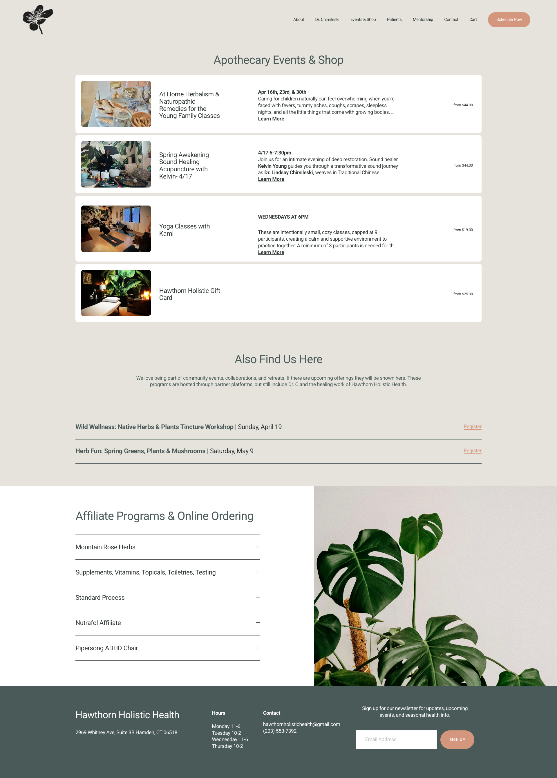
Shop page features a cleaner, more organized layout, with item previews showing additional information to engage users and encourage higher conversion rates.
The Doctor’s page, a key representation of the practice, is now clean, focused, and user-friendly, featuring clear calls to action and enhanced content to better showcase their expertise.
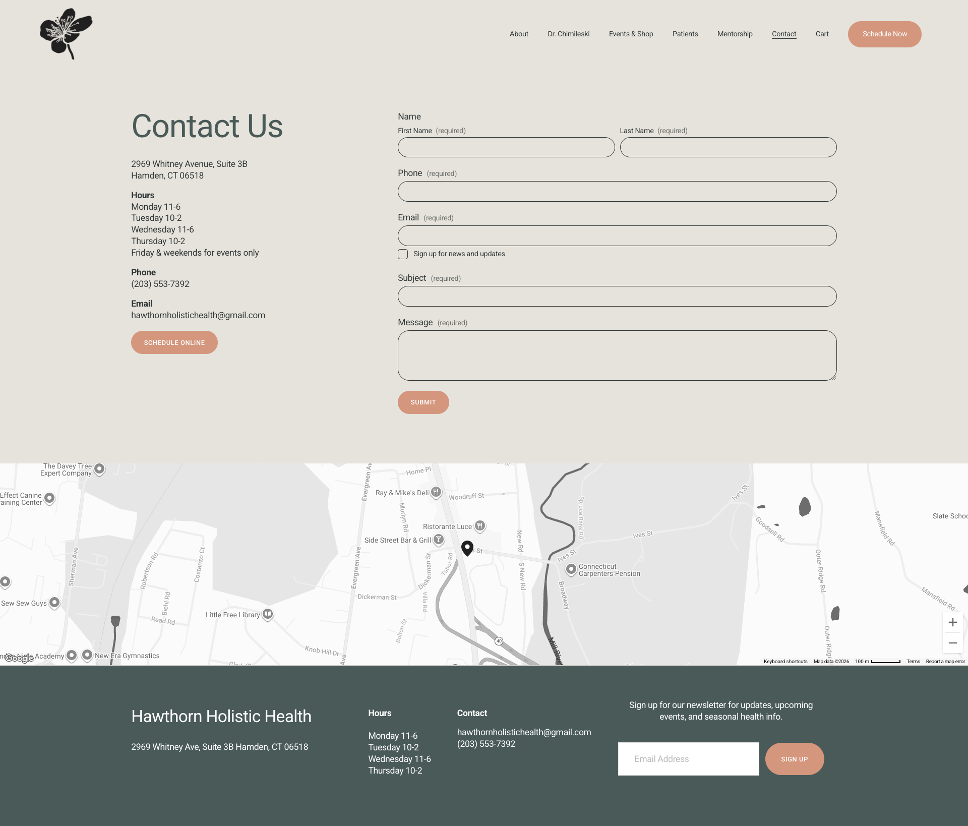
Redesigned Contact page with a cleaner layout, clear information, and an easy to use contact form for improved usability.
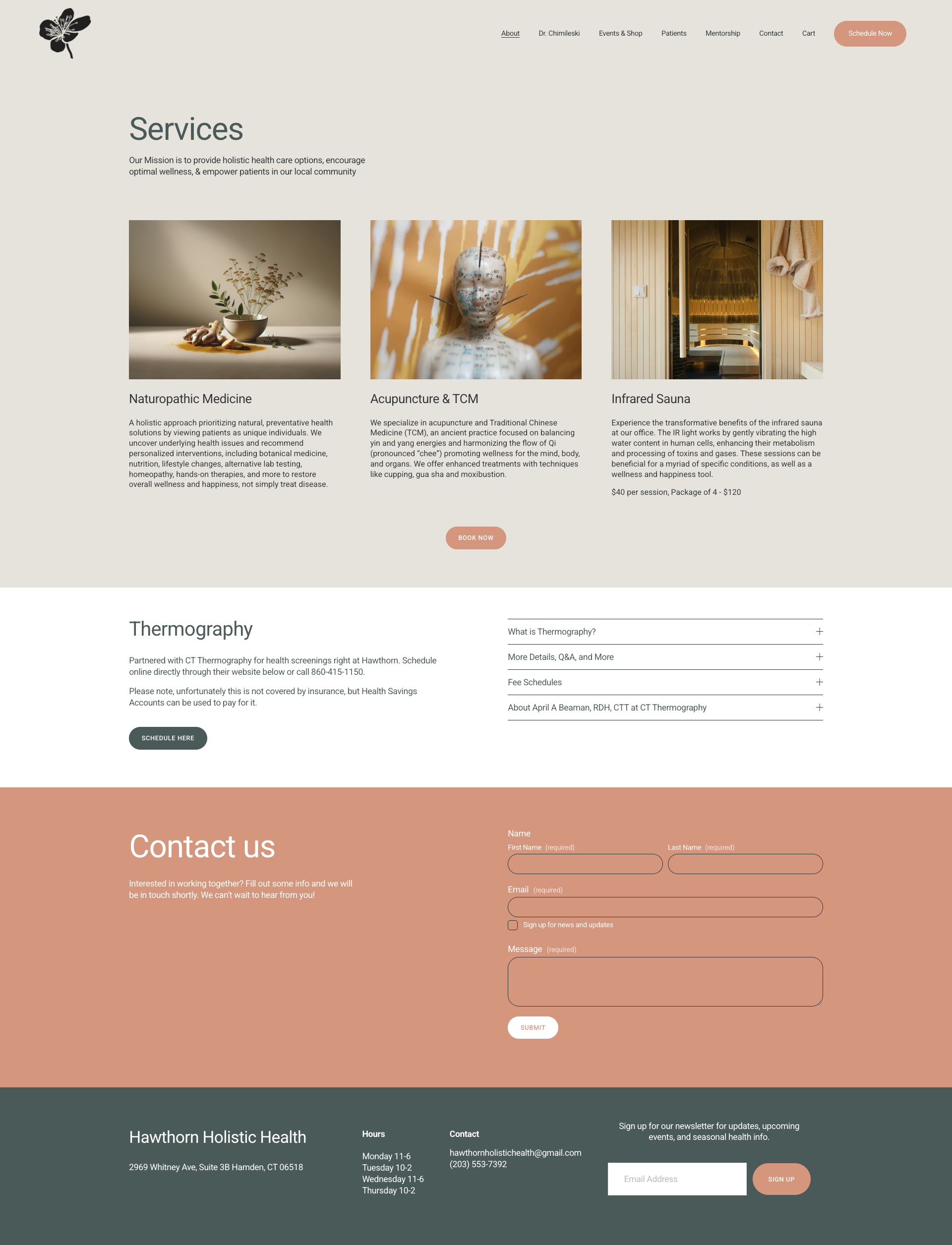
Services page is unified and well-organized, replacing the scattered layout of the old site, with multiple clear and effective calls to action.
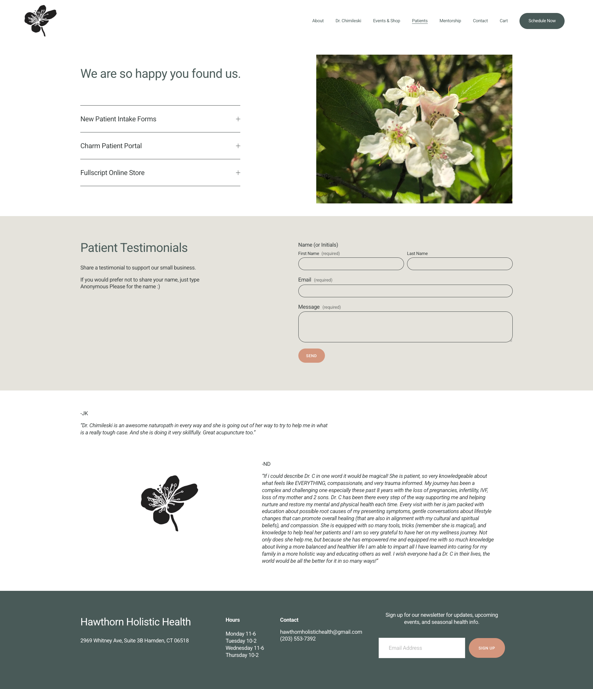
Revamped Patient page with a cohesive design and accordion-style dropdowns, keeping all essential information accessible in a clean, organized layout.
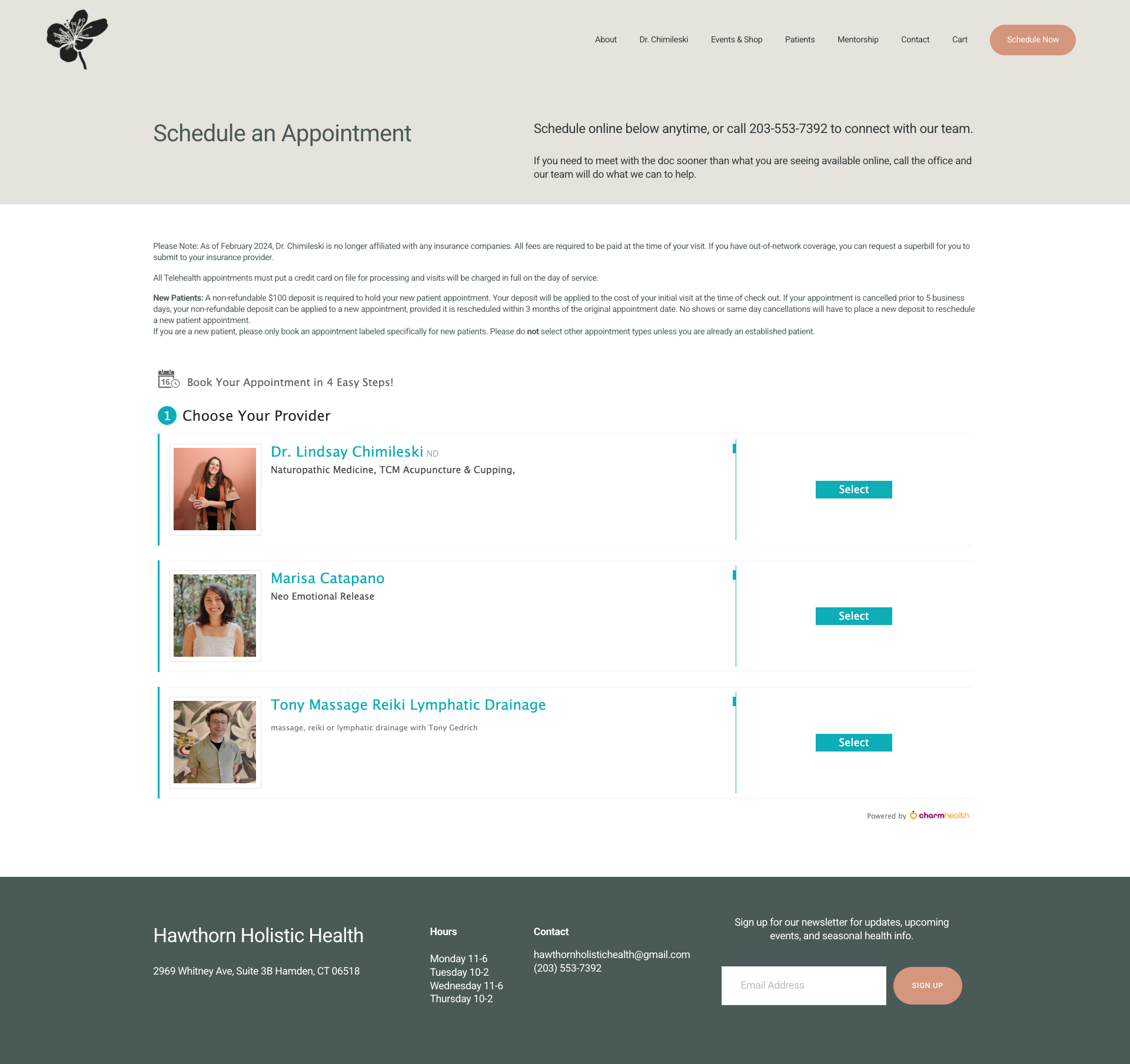
Added a dedicated Scheduling page with a prominent navigation button, making booking easier for users and driving an increase in new patient appointments after launch.
STRATEGY
02. SEO Optimization
To improve discoverability, foundational SEO practices were implemented across the site. This included keyword-focused titles and meta descriptions, improved page structure and hierarchy, optimized service pages, better internal linking, and local SEO updates to boost visibility in nearby searches.
These updates helped ensure the website was not only visually improved but also better positioned for long-term organic visibility.
03. EMAIL MARKETING
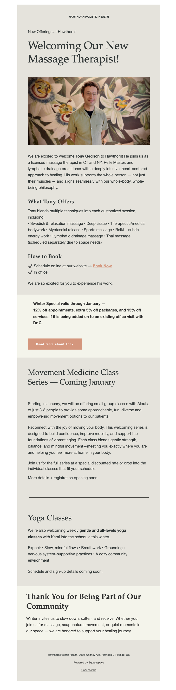
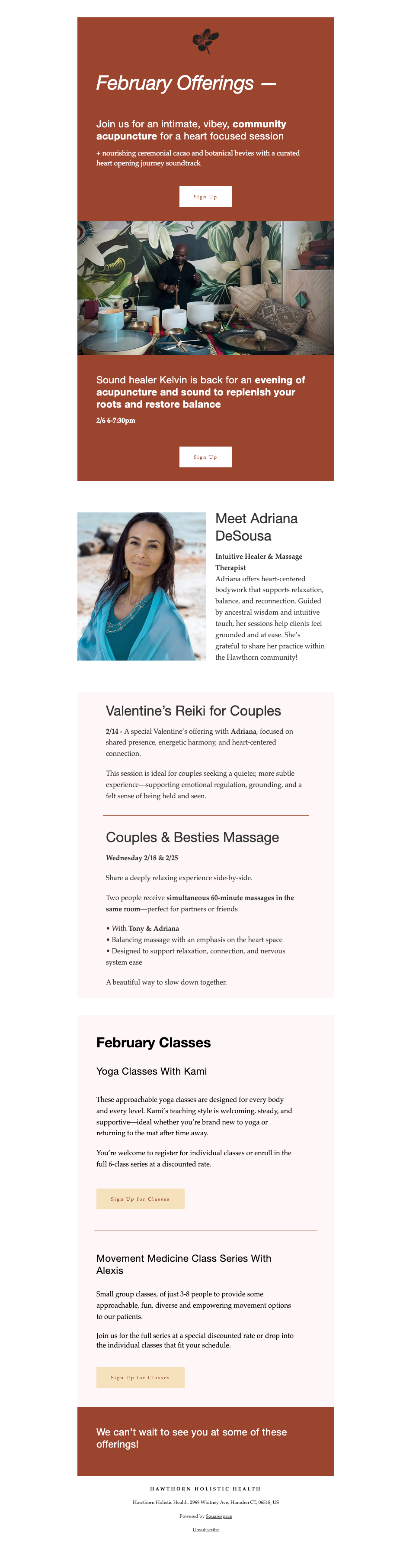
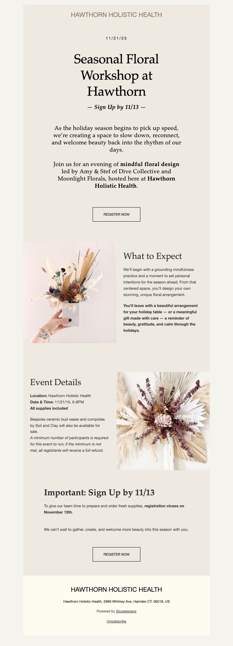
I took over and redesigned the existing email marketing, transforming cluttered, overwhelming emails into a clearer, more engaging experience that better supported patient communication.
Updates included:
Simplified email layouts with clear visual hierarchy
Stronger calls-to-action
Improved readability and content structure
Consistent brand styling across all communications
The email system now supports educational newsletters, practice updates and community events, appointment reminder automation, and patient engagement campaigns.
These improvements helped create communication that feels informative, approachable, and easy to engage with.
EMAIL EXAMPLES
RESULTS
The redesigned digital ecosystem produced measurable improvements in both patient engagement and practice growth.
Key Outcomes
71% increase in new patient bookings within the first month after new website launch
52% average email open rate, significantly increasing patient engagement
Improved website navigation and user experience
Stronger online presence and search visibility
More consistent and trustworthy brand presentation across digital platforms
The improvements allowed the practice’s digital presence to better reflect the intentional care and professionalism patients experience in person.
KEY TAKEAWAY
This project demonstrated how thoughtful design and strategic marketing systems can work together to elevate both brand perception and measurable business outcomes.
By aligning a visually appealing and functional user experience, search visibility, and patient communication, the practice now has a digital foundation that supports continued growth while staying true to its mission of providing personalized, holistic care.